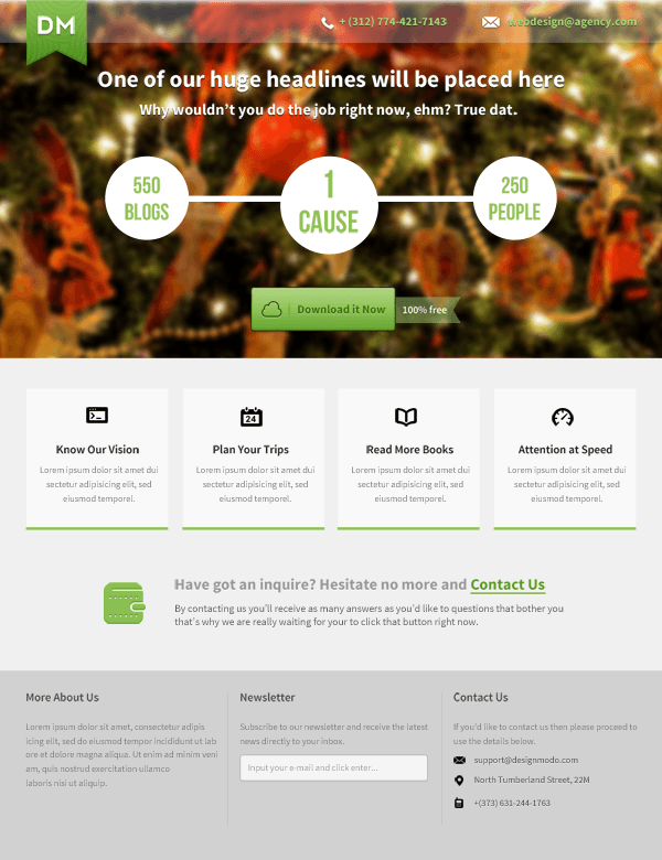
In this web design tutorial we will be creating a captivating landing page with Adobe Photoshop. There is nothing complicated with this design. This landing page layout can be used for many types of websites, so feel free to modify the text, navigation menu, imagery, icons, and so forth to match your own particular needs. Some example use cases of this landing page design: a downloadable product (such as an e-book), a design agency landing page, a web app landing page, or a mobile app landing page.
Tutorial Preview
You can click the image below to see the final result in full size.
Step 1: Basic Photoshop Document Set-Up
For this landing page, we will be relying on a grid system. We can use the popular 960 Grid System. This will help us align the web design’s elements easier.
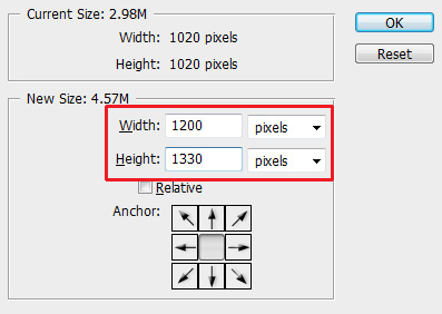
Let’s modify the width and height of the PSD’s canvas so we have a bit more room to work on. Go to Image > Canvas Size and set the Width to 1200px and Height to1330px.
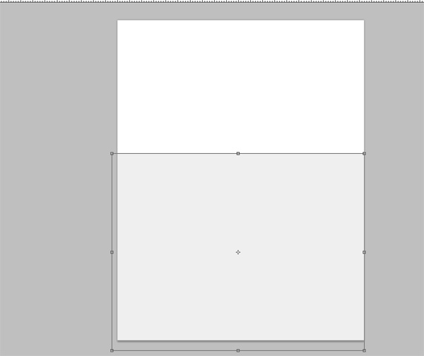
Leave about 245px from the top of the layout for our main header image.
Give a gray color (#f0f0f0) to the remaining space of the layout. You can do this a variety of ways. My way is to use the Rectangle Tool. Choose the Rectangle Tool from the Tools panel. In the Options bar, make sure that the Shape layers option is selected and set the Color option to the desired color: #f0f0f0. Draw a rectangle that covers the entire canvas except for the top 245px of the canvas. Rename the layer to something like "base".
Step 2: Header Image
Find any large photo that you would like to use as a background for the header of our landing page. Make sure the photo you choose is at least
1200px wide and
245pxhigh. Perhaps you can find a photo from a
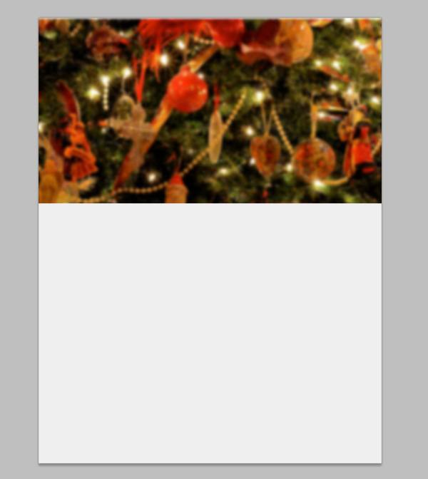
free stock photo website. Place the image at the top of the canvas.
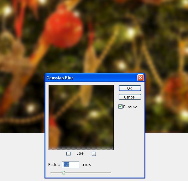
We will give the photo a blurry effect. There are a few ways to do this, but we’ll stick to the simplest one: Go to Filter > Blur > Gaussian Filter. Set the Radius option to 4.0px.
Step 3: Top Navigation Bar
Use the Rectangle Tool (M) to create a horizontal rectangle bar at the very top edge of the canvas that’s 20px in height and that spans the entire width of your canvas.
Give the layer an Opacity of 25% — this is how we will achieve that semi-transparent bar at the top.
Switch to the Horizontal Type Tool (T).
We will use the
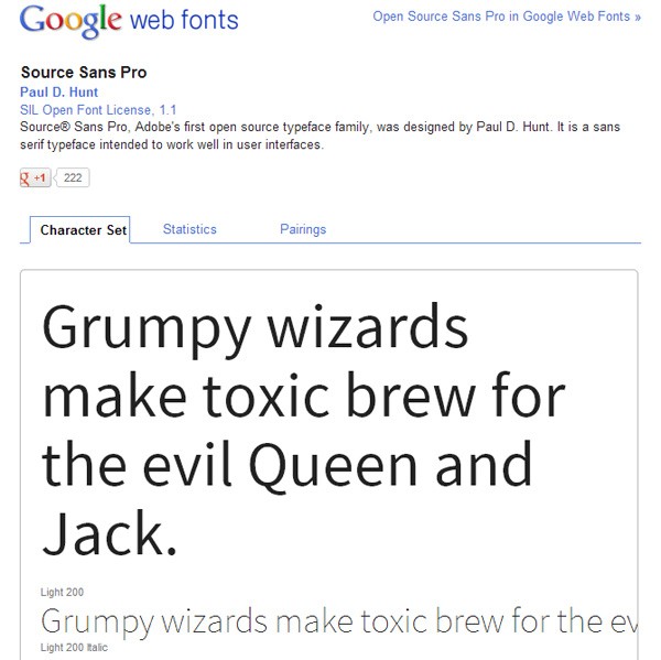
Source Sans Pro font, which can be downloaded for free at Google Web Fonts.
In the Options bar, you can set up your Horizontal Type Tool so that:
- font family: Source Sans Pro
- font style: Bold
- font size: 16px
- text color: #aed572 (a green color)
Use the Horizontal Type Tool to write down the telephone number and a fictional e-mail address, or any text you would like to use.
I will also use a few nice icons I got from the
Impressionist UI icon set. You might also prefer using a
free icon set so go ahead and do whatever works for you.
I’ll set the color for the icons as white, #ffffff.
After the text and the icons are properly in order, apply the Drop Shadow layer effect on them.
Here is a preview of our work so far:
Step 4: Ribbon-Shaped Logo
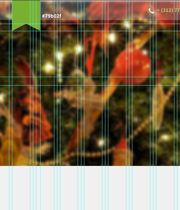
Reveal the Photoshop guides built into the 960 Grid System PSD file by going to View > Show > Guides. These guides will help us align stuff on the canvas, including the green ribbon-shaped logo we will make in this step.
To create a similar shape as the one you can see on the top left corner of our landing page layout, you can place additional guides on your canvas and then use the Pen Tool (P) to follow the guides to achieve the shape. Give the shape a light green color (#79b02f).
We will style our ribbon-shaped logo base a little bit. We will do this with a
layer style— one of the most powerful and popular features in Photoshop.
Start by adding a light Inner Shadow layer effect with the Opacity set at 35%.
We will also add some depth to the logo base by applying a Bevel and Emboss layer effect. Set the Opacity option to 0% for the Highlight Mode option (because we don’t need the highlight effect) and set the Opacity option for the Shading Mode option to15%.
We’ll also add a soft Gradient Overlay layer effect to the shape. I like how setting theBlend Mode to Soft Light and using an Opacity of about 50% looks for this particular shape.
We will then use the
Pattern Overlay layer effect to apply an interesting pattern to the logo base. I found and installed a Photoshop pattern to use for our logo (read Design Instruct’s Photoshop
Patterns: Ultimate Guide to learn more about Photoshop patterns), but choose any pattern that you like as long as it has an interesting shape and it’s subtle.
I set the Opacity option of the Pattern Overlay layer effect to 5%.
Now type some text on top of the logo base using the Horizontal Type Tool. I used the free
Nevis font with
font style set to
Bold and
font size set to
36px to write down two letters —
"DM".
After that, I gave the text layer a Drop Shadow layer effect.
Step 5: Headlines In The Header
I use the Source Sans Pro font with the font style set to Bold to write the headlines. The bigger headline uses 24pt font size and the smaller headline below the bigger headline is in 18pt font size.
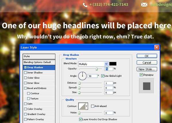
I gave the headlines a Drop Shadow layer effect.
Step 6: Circles Graphic
Let’s create the circles graphic that sits below the headlines. It consists of two circles of the same size, and a bigger one in the center, all connected by a 5px-line.
Use the Ellipse Tool to create the circles and then the Line Tool with the Weight option set to 5px to create the 5px-line that goes through them.
Using the
Bebas Neue font, I placed some random texts and centered them inside each circle. Increase the size of the font in the middle circle by about
+10pt.
Step 7: Primary Call-to-Action Button
Under our circles graphic, we will be creating a call-to-action
web button.
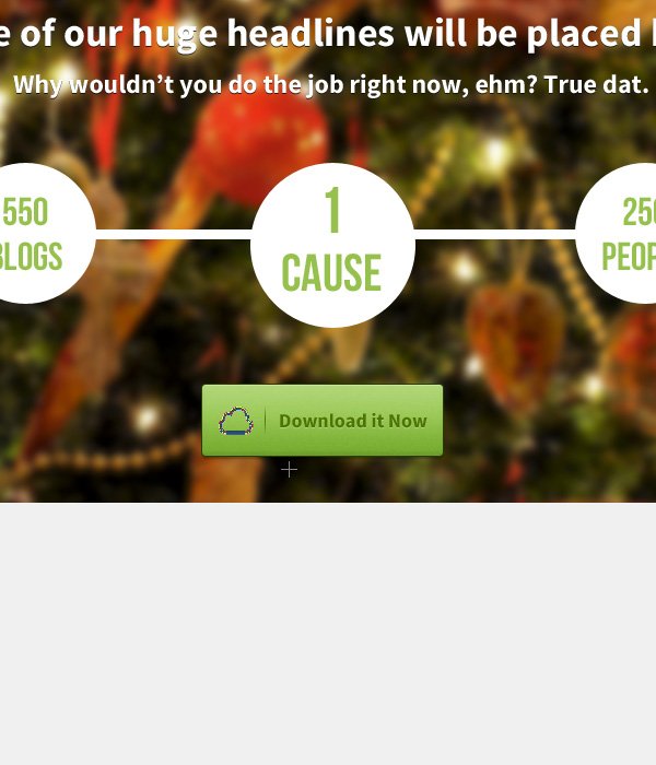
First, create the shape of the call-to-action button using the Rounded Rectangle Tool. In the Options bar, make sure that the Shape layers option is selected, the Radiusoption is set to 3px and the Color option is set to a light green color, #96c64f.
Then create a shape of about 7px wide and 35px high.
Give the shape a Drop Shadow layer effect.
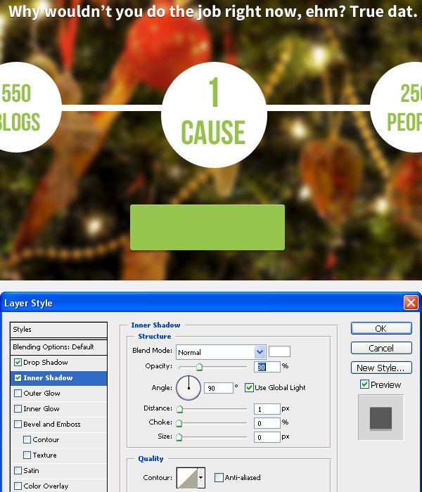
Also give the shape an Inner Shadow layer effect. Set the Distance option to 1px and the Opacity option to 30%.
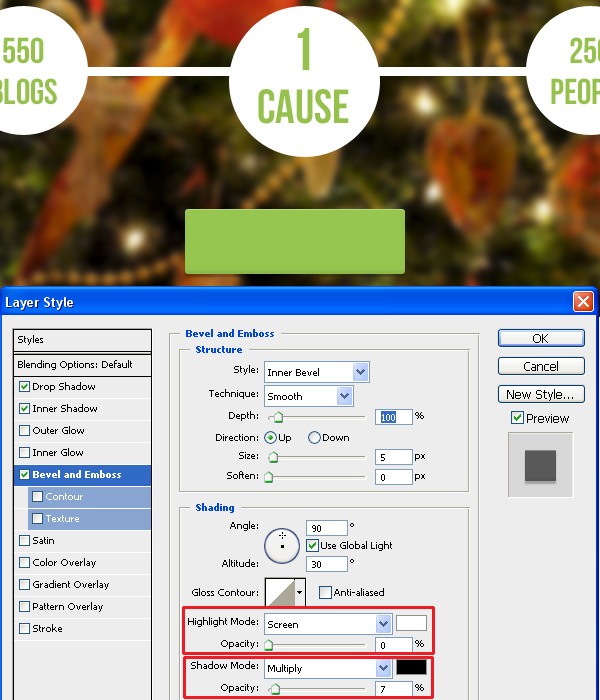
Add the Bevel and Emboss layer effect to the call-to-action button. It should be barely visible so as to not overdo this popular design effect. However, I really like to add some depth to web buttons, and Bevel and Emboss is good for this. To make the effect barely visible and subtle, set the Opacity for the Highlight Mode option to 0%and set the Opacity for the Shadow Mode option to 7%.
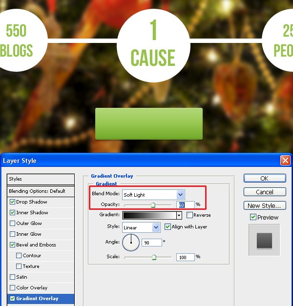
Let’s add a Gradient Overlay layer effect to the button. Set the Blend Mode to Soft Light and the Opacity to 60%.
Next, let’s give the button a noise texture. There are various techniques for doing this, but I’ll stick to the one that is super easy to do: Creating a custom Photoshop pattern. I’ve outlined the process below:
- Create a new Photoshop document (of any size)
- Create a new layer and delete the default Background layer
- Go to Select > All (which will place a marquee selection around the canvas) to select the entire canvas
- Choose Edit > Fill to fill the layer
- Deselect your selection by going to Select > Deselect
- Apply a very noticeable Noise filter to the layer by going to Filter > Noise > Add Noise
- Select the entire canvas again (Select > All)
- Go to Edit > Define Pattern and save your pattern
You’ve now created a custom Photoshop pattern.
Next, go back to your main Photoshop document and give the web button a Pattern Overlay layer effect using the custom Photoshop pattern you just created.
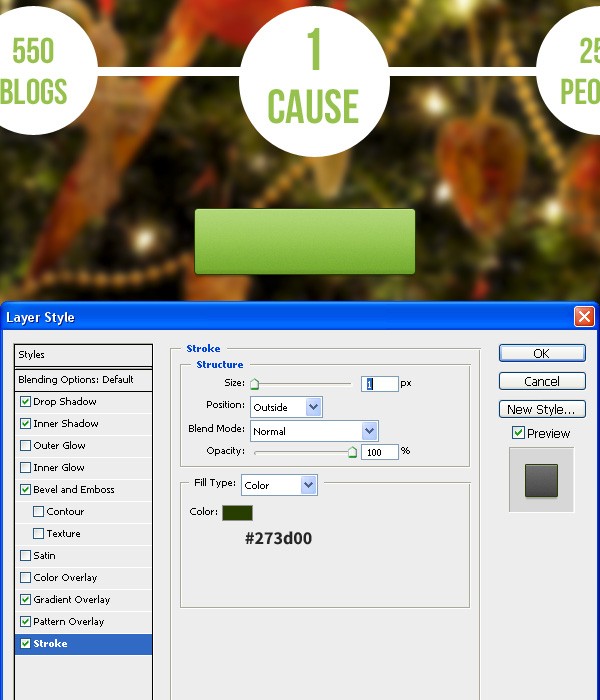
Let’s give this web button a Stroke layer effect. We’ll give it a dark green stroke. The upper part of the stroke around our button will be barely visible due the background, but you can spot the subtle stroke in the center and lower parts.
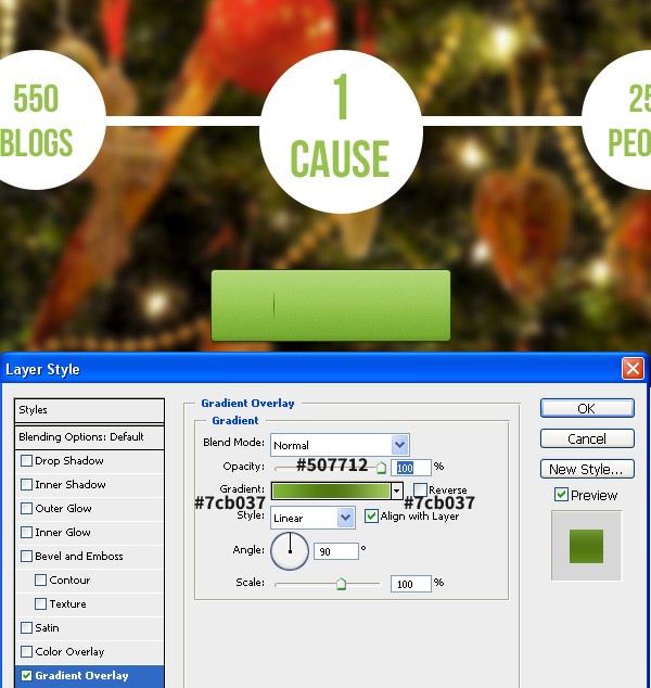
Now we’ll create a small shape which will be a divider between an icon and the text for the button. To create this, use the Line Tool to create a vertical line of about 10pxin height. Apply the Gradient Overlay layer effect on the vertical line.
Use the same font we used in the headline texts (Nevis) to type some text on the web button. I’ve simply written down the phrase, Download it Now.
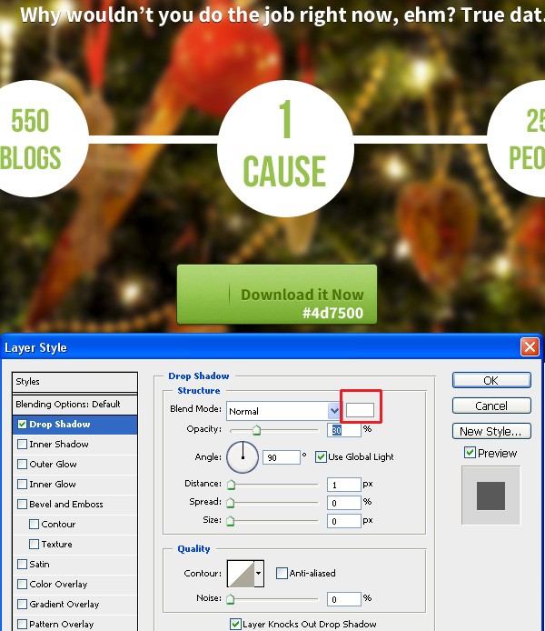
Give the text a dark green color (#4d7500) and apply a Drop Shadow effect with thecolor of the shadow set to white (#ffffff) and the Opacity at 30%.
Step 8: Cloud Icon (For The Primary Call-to-Action Button)
Okay, now we’ll create a cloud icon. You can skip this step if you want to use a premade icon from an icon set.
It’s relatively easy to create a cloud icon and we’ll do that now.
First, use the Elipse Tool to create 4 to 5 circles. Hold down the Shift key while you draw the circles so you end up with only one shape and one layer instead of 4 to 5 shapes separated in 4 to 5 layers.
Now, set the Fill option of the cloud icon layer to 0% — you can do this in the Layers panel.
After that, give the layer a Stroke layer effect to give the cloud icon a 2px, dark green stroke.
Step 9: Ribbon Shape Beside The Primary Call-to-Action Button
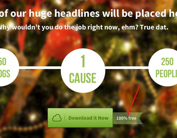
Following the same technique that we used to create the logo’s base, create a light green shape and place it behind our button.
Reduce the Opacity option of the light green shape so that some of the background photo shows through.
Type some text on top of it. I typed "100% free".
Step 10: "Featured" Section
Let’s work on the "Featured" section.
Use the Rectangle Tool (U) to create a shape with the width of 220px and 214pxheight.
At the bottom of the rectangle shape, I’ll also add a green rectangle (#91c04c) of about 5 pixels in height.
Use an icon from any icon pack and place it at the top-center of the rectangle shape.
Use the Horizontal Type Tool (T) with the Source Sans Pro font to give our title a dark gray color (#262626) and a lighter gray for the text (#9c9c9c).
Duplicate the above group 3 times, so that we end up with 4 of them. The only change we’ll make in the other 3 copies are the icons used and the heading text.
Use the Nevis font with the font style set to Bold and font size of 18pt, and write down a sentence. The gray color used is the same as for the paragraphs in the previous steps. And the green is the same as the color of bottom bars.
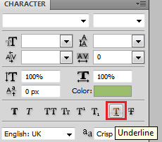
Put some emphasis on the last part ("Contact Us") because it will be a hyperlink. In the Character panel (if you can’t find the Character panel, go to Window > Character), use the underline option to place an underline below the "Contact Us" text.
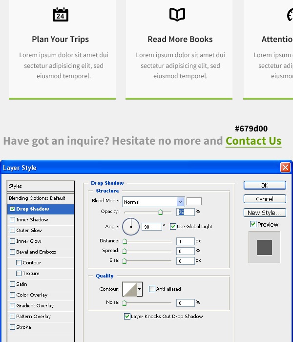
Give the text a Drop Shadow layer effect.
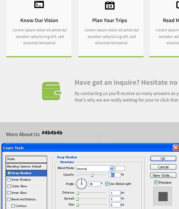
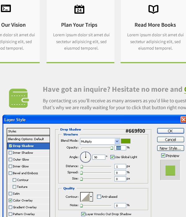
Use the same gray color and write down a paragraph of text and place it under the heading text. Grab a wallet icon (I got mine from Impressionist UI) from your chosen icon set, and give it to the same color as we used for the other icons. Then give it aDrop Shadow layer effect with the green color shown in the following image.
Step 11: Footer
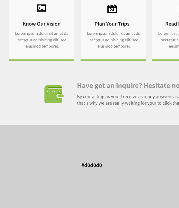
Use the Rectangle Tool (U) to create a shape that’s 1200px in width and 280px in height. Give it a light gray color (#d0d0d0). This will be the background for our footer.
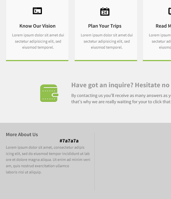
Use the Horizontal Type Tool (T) and the same font as before to input some heading text like on the following image. We will divide our footer into three sections, and each section will have a heading. As shown below, the first section’s heading is "More About Us". We will apply a Drop Shadow layer effect to the heading texts withOpacity set to 1%.
Use the same font to write a paragraph of dummy text. Give this text a lighter color (#7a7a7a).
Use the Line Tool (U) to create a simple gray line that will be a divider line for each section.
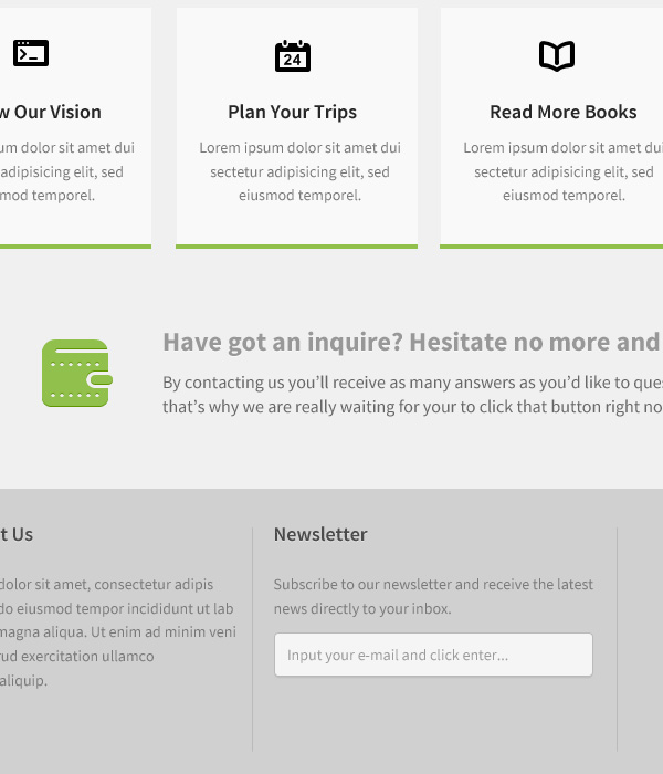
The next section of our web design’s footer will be the "Newsletter" section. Create the newsletter text input field by using the Rounded Rectangle Tool (U) with a Radiusof 3px. Give the newsletter background a very light gray color (#f5f5f5). Give it a subtle Drop Shadow effect. Give the shape a really subtle 1px Stroke layer effect. Use the Horizontal Type Tool (T) to input some text in the shape.
Our last section in the Footer is the "Contact Us" section. This is pretty simple to create, especially if you’ve followed along until this point. It’s very similar to the other steps, except for the icons (which I got from the Impressionist UI set) and a little bit darker text color for the e-mail, location and phone number texts.
Tutorial Summary
In this web design tutorial, we created a simple and usable landing page layout using Photoshop. We used a variety of popular techniques for creating the different components of the design.
Here is our final result:
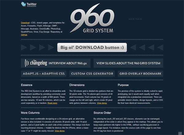 Download the 960 Grid System ZIP file from the project’s official website, extract its contents, and then open the 12-column Photoshop PSD file. The file is named960_grid_12_col.psd. The file is inside the templates\photoshop folder.
Let’s modify the width and height of the PSD’s canvas so we have a bit more room to work on. Go to Image > Canvas Size and set the Width to 1200px and Height to1330px.
 Leave about 245px from the top of the layout for our main header image.
Give a gray color (#f0f0f0) to the remaining space of the layout. You can do this a variety of ways. My way is to use the Rectangle Tool. Choose the Rectangle Tool from the Tools panel. In the Options bar, make sure that the Shape layers option is selected and set the Color option to the desired color: #f0f0f0. Draw a rectangle that covers the entire canvas except for the top 245px of the canvas. Rename the layer to something like "base".




 Switch to the Horizontal Type Tool (T).
We will use the Source Sans Pro font, which can be downloaded for free at Google Web Fonts.
 In the Options bar, you can set up your Horizontal Type Tool so that:
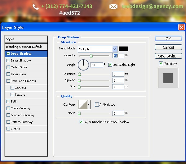 Here is a preview of our work so far:



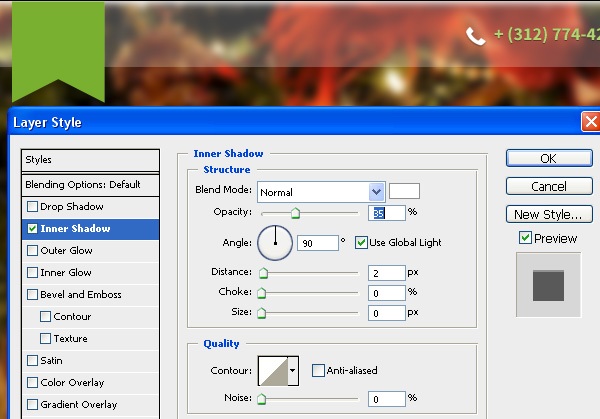
 We will style our ribbon-shaped logo base a little bit. We will do this with a layer style— one of the most powerful and popular features in Photoshop.
Start by adding a light Inner Shadow layer effect with the Opacity set at 35%.
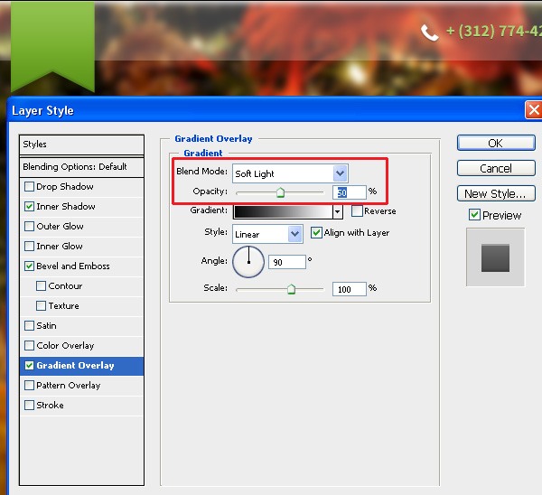
 We will also add some depth to the logo base by applying a Bevel and Emboss layer effect. Set the Opacity option to 0% for the Highlight Mode option (because we don’t need the highlight effect) and set the Opacity option for the Shading Mode option to15%.
 We’ll also add a soft Gradient Overlay layer effect to the shape. I like how setting theBlend Mode to Soft Light and using an Opacity of about 50% looks for this particular shape.
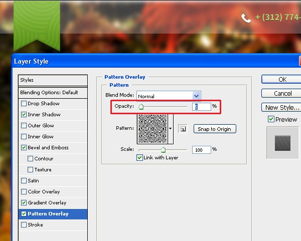
 We will then use the Pattern Overlay layer effect to apply an interesting pattern to the logo base. I found and installed a Photoshop pattern to use for our logo (read Design Instruct’s Photoshop Patterns: Ultimate Guide to learn more about Photoshop patterns), but choose any pattern that you like as long as it has an interesting shape and it’s subtle.
You can find many free Photoshop patterns from this website: subtlepatterns.com.
I set the Opacity option of the Pattern Overlay layer effect to 5%.
 Now type some text on top of the logo base using the Horizontal Type Tool. I used the free Nevis font with font style set to Bold and font size set to 36px to write down two letters — "DM".
After that, I gave the text layer a Drop Shadow layer effect.


 I gave the headlines a Drop Shadow layer effect.


 Using the Bebas Neue font, I placed some random texts and centered them inside each circle. Increase the size of the font in the middle circle by about +10pt.



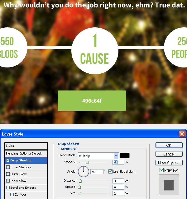 Also give the shape an Inner Shadow layer effect. Set the Distance option to 1px and the Opacity option to 30%.
 Add the Bevel and Emboss layer effect to the call-to-action button. It should be barely visible so as to not overdo this popular design effect. However, I really like to add some depth to web buttons, and Bevel and Emboss is good for this. To make the effect barely visible and subtle, set the Opacity for the Highlight Mode option to 0%and set the Opacity for the Shadow Mode option to 7%.
 Let’s add a Gradient Overlay layer effect to the button. Set the Blend Mode to Soft Light and the Opacity to 60%.
 Next, let’s give the button a noise texture. There are various techniques for doing this, but I’ll stick to the one that is super easy to do: Creating a custom Photoshop pattern. I’ve outlined the process below:
 Let’s give this web button a Stroke layer effect. We’ll give it a dark green stroke. The upper part of the stroke around our button will be barely visible due the background, but you can spot the subtle stroke in the center and lower parts.
 Now we’ll create a small shape which will be a divider between an icon and the text for the button. To create this, use the Line Tool to create a vertical line of about 10pxin height. Apply the Gradient Overlay layer effect on the vertical line.
 Use the same font we used in the headline texts (Nevis) to type some text on the web button. I’ve simply written down the phrase, Download it Now.
Give the text a dark green color (#4d7500) and apply a Drop Shadow effect with thecolor of the shadow set to white (#ffffff) and the Opacity at 30%.




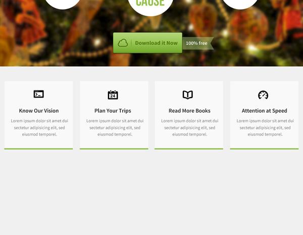
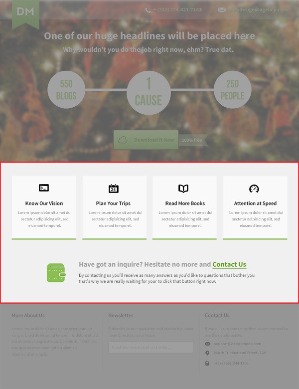 Use the Rectangle Tool (U) to create a shape with the width of 220px and 214pxheight.
At the bottom of the rectangle shape, I’ll also add a green rectangle (#91c04c) of about 5 pixels in height.
Use an icon from any icon pack and place it at the top-center of the rectangle shape.
Use the Horizontal Type Tool (T) with the Source Sans Pro font to give our title a dark gray color (#262626) and a lighter gray for the text (#9c9c9c).
Duplicate the above group 3 times, so that we end up with 4 of them. The only change we’ll make in the other 3 copies are the icons used and the heading text.
 Use the Nevis font with the font style set to Bold and font size of 18pt, and write down a sentence. The gray color used is the same as for the paragraphs in the previous steps. And the green is the same as the color of bottom bars.
Put some emphasis on the last part ("Contact Us") because it will be a hyperlink. In the Character panel (if you can’t find the Character panel, go to Window > Character), use the underline option to place an underline below the "Contact Us" text.
 Give the text a Drop Shadow layer effect.
 Use the same gray color and write down a paragraph of text and place it under the heading text. Grab a wallet icon (I got mine from Impressionist UI) from your chosen icon set, and give it to the same color as we used for the other icons. Then give it aDrop Shadow layer effect with the green color shown in the following image.


 Use the Horizontal Type Tool (T) and the same font as before to input some heading text like on the following image. We will divide our footer into three sections, and each section will have a heading. As shown below, the first section’s heading is "More About Us". We will apply a Drop Shadow layer effect to the heading texts withOpacity set to 1%.
 Use the same font to write a paragraph of dummy text. Give this text a lighter color (#7a7a7a).
 Use the Line Tool (U) to create a simple gray line that will be a divider line for each section.
 The next section of our web design’s footer will be the "Newsletter" section. Create the newsletter text input field by using the Rounded Rectangle Tool (U) with a Radiusof 3px. Give the newsletter background a very light gray color (#f5f5f5). Give it a subtle Drop Shadow effect. Give the shape a really subtle 1px Stroke layer effect. Use the Horizontal Type Tool (T) to input some text in the shape.
 Our last section in the Footer is the "Contact Us" section. This is pretty simple to create, especially if you’ve followed along until this point. It’s very similar to the other steps, except for the icons (which I got from the Impressionist UI set) and a little bit darker text color for the e-mail, location and phone number texts.

